

The magic of a great interface
Have you ever used an app or website where everything flows naturally, without the need for tutorials or instructions? That’s the essence of an exceptional user interface (UI) design: intuitive, strategic, and user-centered.
Although we often think of UI as a matter of functionality, we shouldn’t forget that graphic design is the starting point for creating attractive, intuitive interfaces that align with each brand’s visual identity. The combination of good graphic design and UX principles is the key to creating memorable digital experiences.
At BluePixel, we understand that a well-designed site not only enhances the browsing experience but also drives conversion and customer loyalty. That’s why we’re sharing 25 real examples of user interfaces, categorized by type, to inspire you to optimize your business platform.
Types of User Interfaces and Inspiring Examples
1. Duolingo – Conversational UI + Graphical User Interface (GUI)

What it does well:
Guides users step-by-step with small challenges, friendly icons, and instant feedback.
Why it works:
It makes language learning feel like a game. Users never get lost—they always know what to do.
How to apply it:
Gamify complex processes like onboarding or internal training.
2. Dropbox – Graphical User Interface (GUI)
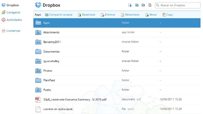
What it does well:
Highlights only the essentials: upload, organize, and share files.
Why it works:
No distractions—clear icons and direct labels. Users always know where to click.
How to apply it:
Focus your design on your product’s key actions.
3. Stripe Dashboard – GUI + Dashboard UI

What it does well:
Displays complex metrics (revenue, users, trends) with a clear visual hierarchy.
Why it works:
Users can make decisions based on data—no need for tutorials.
Howto apply it:
Use dashboards with strong hierarchy to surface what matters most.
4. Airbnb Host – GUI + Mobile UI

What it does well:
Allows users to manage bookings, messages, and pricing from one screen with guided steps.
Why it works:
The design adapts to different contexts—from mobile to desktop.
How to apply it:
Build seamless cross-device experiences.
5. Figma – GUI + Collaborative Interface

What it does well:
Multiple users can design together, see live changes, and leave comments.
Why it works:
It simplifies teamwork. No need to explain—just join and collaborate.
How to apply it:
Integrate collaborative features and visible feedback into your platform.
6. Calendly – UI + Optimized Web UI

What it does well:
Users can book in three clicks—no unnecessary forms.
Why it works:
It saves time and eliminates email back-and-forth.
How to apply it:
Streamline your most common interaction flows (sign-up, scheduling, payments).
7. Google Drive – GUI + Functional Visual Cues
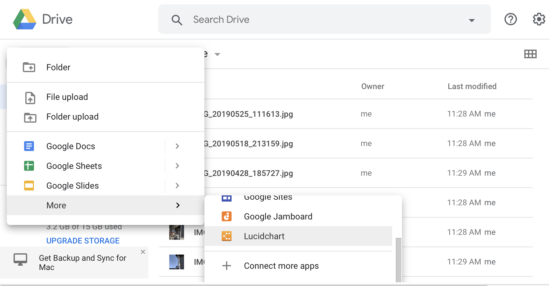
What it does well:
Uses color, icons, and labels to quickly locate files and folders.
Why it works:
Users rely on visual recognition—not memory—to navigate.
How to apply it:
Use visual systems that help users scan and filter content effortlessly.
8. Mercado Libre – GUI + Smart Forms

What it does well:
Provides a straight forward buying process with clear steps and intelligent forms.
Why it works:
Reduces drop-off by always showing the next step—no surprises.
How to apply it:
Review and refine your critical flows (checkout, contact) for clarity and speed.
9. Trello – Drag & Drop UI

What it does well:
Uses drag-and-drop cards that are self-explanatory at a glance.
Why it works:
Makes task and project management easy—even for new users.
How to apply it:
Use visual metaphors (like boards or lists) to represent workflows.
10. Google Maps – GUI + Touch Interface

What it does well:
Let users explore, get suggestions, and find routes without confusion.
Why it works:
Displays exactly what the user needs, exactly when they need it (contextual relevance).
How to apply it:
Adapt your UI to the user's moment—what they’re doing, where they are, and what they need.
Designing with the User in Mind
Each of these examples shows that an effective user interface design not only looks good but also feels natural and makes interaction effortless. This is possible thanks to the combination of graphic design and a carefully crafted user experience: visual elements, typography, and colors work together to guide the user and convey the essence of the brand.
At BluePixel, we specialize in creating digital experiences that balance aesthetics and functionality, always centered on the user’s needs. Ready to take your platform to the next level? Explore BluePixel’s services and discover how we can help you transform your idea into a successful digital solution.

.png)
![What is UX Writing and what does a UX Writer do? [Introductory Guide]](https://cdn.prod.website-files.com/64c96252c4314a904a4fb7bd/680971f5e1f288dce056fe8b_ux-writing.webp)