


Table of Contents
- Introduction: The Importance of Adaptive Design Today
- What Is Responsive Web Design?
- Difference Between Responsive, Adaptive, and Mobile-First Design
- Difference Between Responsive, Adaptive, and Mobile-First Design
- Why Having a Responsive Website Matters
- The Impact of Responsive Design on SEO and Core Web Vitals
- The Impact of Responsive Design on SEO and Core Web Vitals
- How to Tell If a Website Is Responsive
- Basic Browser and Mobile Tests
- Online Tools to Check Responsive Design
- Basic Browser and Mobile Tests
- Key Principles of Responsive Design
- Most Common Breakpoints in 2025
- Common Responsive Design Mistakes
- How to Implement Responsive Design Step by Step
- Conclusion: Responsive Design as a Digital Quality Standard
- Checklist: How to Tell If Your Website Is Truly Responsive
- Examples of Websites with Responsive Design
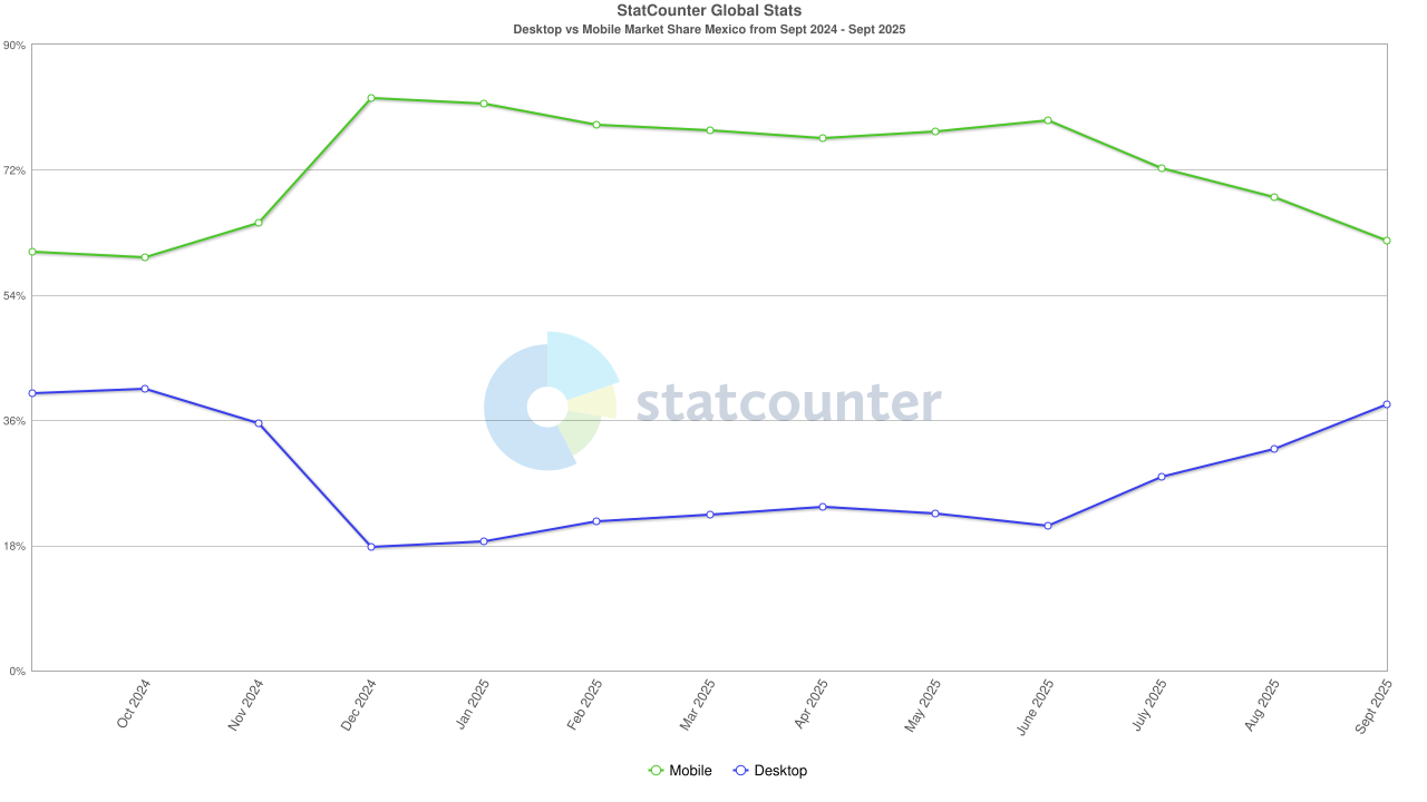
Nowadays, users browse the web on a wide range of devices: phones, tablets, laptops, TVs, and desktop computers. However, mobile devices clearly dominate internet access.
In this context, having a responsive website design is no longer optional—it’s a necessity. An adaptable site not only improves the user experience but also boosts search engine rankings, increases visitor retention, and drives conversions.
In Mexico, more than 70% of web traffic comes from mobile devices. This confirms that the majority of visits to any site happen on small screens.
At BluePixel, we believe that a truly effective responsive web design is one that adapts to the user, no matter what device they’re browsing from. That’s why understanding what “responsive” really means and knowing how to verify whether a site meets these principles is essential for any company that wants to stay competitive in the digital space.
2. What Is Responsive Web Design?
Responsive web design (also known as adaptive web design) is a development approach that enables a website to automatically adjust its structure, content, and visual elements to match the size and resolution of the screen being used.
Instead of creating separate versions for desktop, tablet, or mobile, responsive design uses flexible rules and layouts to ensure an optimal viewing experience on any device.
The concept emerged as a response to the growing diversity of screen sizes and resolutions in the market. Its main goal is to deliver a consistent and functional user experience, regardless of the device or browser being used.
From a technical perspective, a responsive website relies on three main pillars:
- Fluid grids: proportions are expressed in percentages rather than fixed pixels, allowing elements to adapt to the container’s width.
- Flexible images: visual assets automatically resize without losing quality or affecting performance.
- Media queries: CSS rules that modify content presentation based on the device’s width or type.
Thanks to these features, responsive design ensures that a website is always readable, functional, and visually balanced.
2.1 Difference Between Responsive, Adaptive, and Mobile-First Design
Although the terms “responsive,” “adaptive,” and “mobile first” are often used interchangeably, they actually represent different approaches within web development.
- Responsive design: uses fluid structures that continuously adjust to the screen size. It’s flexible and dynamic.
- Adaptive design: uses fixed, predefined layouts for specific screen widths (for example, one for mobile, one for tablet, and another for desktop). It’s less flexible but can offer more precise control in certain environments.
- Mobile first: is a design philosophy that starts by creating the mobile experience first and then scaling up to larger screens. In this approach, the mobile version is the foundation of the project—not an afterthought.
In practice, a modern website usually combines all three ideas: it’s designed with a mobile-first mindset, developed using responsive techniques, and incorporates adaptive behaviors where needed.
3. Why Having a Responsive Website Matters
Having a responsive website isn’t just about visual appeal—it has a direct impact on usability, SEO, conversions, and brand perception. In an increasingly competitive digital landscape, a website that doesn’t adapt properly to mobile devices risks losing visibility and potential customers.
Below are the main reasons why responsive design is essential:
- Better user experience (UX): an adaptable site allows content to be easy to read and navigate without zooming in or scrolling horizontally.
- Longer session durations: users stay on the site longer when it displays correctly on their device.
- Higher conversions: forms, buttons, and calls to action optimized for mobile lead to increased conversion rates.
- Lower bounce rate: smooth and fast navigation reduces site abandonment.
- Simplified maintenance: one responsive site is easier and more cost-effective to maintain than multiple separate versions.
Discover more signs that your website may urgently need a redesign—for example, if you can’t make edits without relying on a provider, or if your site is slow.
And remember, at BluePixel, we’re experts in developing UX/UI-driven websites designed to help your project achieve the best possible conversion rates.
3.1 The Impact of Responsive Design on SEO and Core Web Vitals
For several years now, Google has used mobile-first indexing, which means it primarily analyzes and evaluates the mobile version of a website to determine its ranking in search results. If a site isn’t optimized for mobile devices, its organic visibility will be affected and search engines may not display it properly.
In addition, Core Web Vitals—Google’s key indicators of website performance—focus on the mobile user experience. These metrics include:
- LCP (Largest Contentful Paint): measures how long it takes for the main content to load.
- FID (First Input Delay): measures how responsive the site is to user interaction.
- CLS (Cumulative Layout Shift): evaluates the visual stability of the site.
A well-implemented responsive design directly improves these metrics by optimizing speed, usability, and content stability on small screens.
In short, responsive web design isn’t just a visual trend—it has become a strategic factor for digital performance, user experience, and organic visibility for any brand.
4. How to Tell If a Website Is Responsive
Recognizing whether a website is truly responsive isn’t always obvious at first glance. However, there are several ways to check it—both directly in a browser and through specialized tools.
A responsive site should automatically adjust its content, images, and structure when viewed on different screen sizes. This means text should remain readable, menus should stay accessible, and interactive elements should work smoothly on any device.
Below are the most practical methods for evaluating whether a page meets responsive design standards.
4.1 Basic Browser and Mobile Device Tests
- Resize the browser window:
On a desktop computer, open the website and gradually reduce the browser window’s width. If the layout adapts without generating horizontal scroll bars, that’s a sign the site is responsive. - Rotate the screen on mobile:
Access the site from a phone or tablet and switch between portrait and landscape mode. Elements should rearrange themselves without overlapping or losing readability. - Inspect elements (developer mode):
In browsers like Chrome or Edge, you can open “Inspect mode” (F12 or right-click > Inspect) and activate the “Responsive Design Mode” or “Device Toolbar.” This feature allows you to preview how the site behaves at different resolutions. - Check navigation usability:
Buttons, forms, and menus should be easily accessible on touch screens. If users need to zoom in or elements overlap, the site isn’t fully adaptable.
4.2 Online Tools to Check Responsive Design
Beyond manual checks, there are free tools that accurately assess whether a site meets responsive standards.
To ensure a website works properly on all devices, its responsive design must be evaluated. Although Google discontinued its Mobile-Friendly Test, several reliable alternatives remain for testing mobile usability and user experience:
a) Lighthouse
Lighthouse is an auditing tool built into Google Chrome that evaluates multiple aspects of a website, including performance, accessibility, SEO, and mobile usability.
To use it:
- Open Chrome and press Ctrl + Shift + I (Windows) or Cmd + Option + I (Mac).
- Go to the Lighthouse tab.
- Select “Mobile” as the device type and run the audit.
Lighthouse generates a report with key indicators such as load speed, font sizes, button touch target spacing, and visual stability.
b) PageSpeed Insights
This online tool analyzes site speed and user experience on both mobile and desktop. In addition to performance metrics, it provides optimization recommendations to improve mobile usability—for example, adjusting image sizes, reducing render-blocking resources, and ensuring proper text and button dimensions.
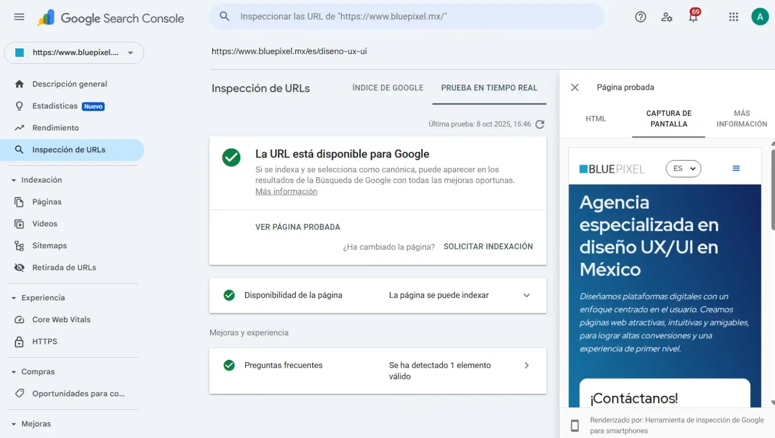
c) Google Search Console (URL Inspection)
While the Mobile-Friendly Test no longer exists, Search Console still provides Page Experience data that affects mobile navigation. Through URL inspection, you can identify issues such as small text, tap target problems, and elements extending off-screen.
d) Manual Testing on Multiple Devices
No tool can replace real user experience. It’s recommended to test your site on smartphones, tablets, and screens of different sizes. Make sure that:
- Text is readable without zooming in.
- Buttons are appropriately sized for touch interaction.
- Menus and content adapt correctly to screen width.
By running these tests, you can ensure your website delivers a smooth and consistent experience across all devices.
Other Useful Tools
- BrowserStack Responsive Test or LambdaTest: allow you to test how your site appears on real physical devices and browsers. (An account may be required.)
- Viewport Resizer: a browser extension that lets you quickly preview a site at specific screen sizes.
These tools are extremely helpful for detecting design flaws, loading issues, or compatibility problems with certain browsers.
5. Key Principles of Responsive Design
Responsive design is built on a series of technical and conceptual principles that ensure a consistent and engaging experience across all devices. The most important are:
- Fluid grid layouts: use relative proportions (percentages, flexible units) instead of fixed pixel values.
- Media queries: adjust CSS styles based on screen width or orientation.
- Adaptive images and videos: multimedia elements automatically resize without distortion or quality loss.
- Clear visual hierarchy: content is prioritized, showing the most essential elements first on smaller screens.
- Multi-device testing: continuous validation is essential to maintain design consistency.
5.1 Most Common Breakpoints in 2025
Breakpoints are the key points in a design where specific rules are applied to adapt the layout.
Based on the most commonly used mobile resolutions in Mexico and worldwide, the following screen widths are the most relevant to consider:
.png)
Defining these breakpoints at the start of a project helps optimize the display and prevents design inconsistencies across devices.
6. Common Responsive Design Mistakes
Even though most modern templates claim to be “responsive,” many websites still have issues that affect both user experience and search rankings. Some of the most frequent mistakes include:
- Not testing on real devices: browser previews don’t always reflect real behavior.
- Ignoring readability: small text or low contrast makes content hard to read on mobile screens.
- Intrusive pop-ups or banners: block the main content and increase bounce rates.
- Unoptimized images: heavy files slow down loading times and hurt Core Web Vitals metrics.
- Inconsistent content between mobile and desktop: hiding important information on mobile can harm SEO.
- Neglecting touch navigation: buttons that are too small or elements placed too close together hurt usability.
A successful responsive design avoids these pitfalls through continuous testing, strategic planning, and proper technical implementation.
7. How to Implement Responsive Design Step by Step
Adopting a responsive approach requires careful planning and attention to detail from the very beginning of the project. Here’s a basic step-by-step guide to make it happen:
- Content planning and analysis:
Identify which information is essential and how it will be structured across different screen sizes. - Mobile-first design:
Start by designing for mobile devices and then scale up to larger screens. This ensures speed, simplicity, and proper content prioritization. - Wireframing and prototyping:
Create visual blueprints that illustrate the adaptable structure before starting development. - Technical implementation with flexible CSS:
Use fluid grids, relative units (%, rem, vw), and min-width–based media queries. - Image and asset optimization:
Incorporate modern formats like WebP and techniques such as lazy loading. - Testing and refinement:
Validate behavior across different devices, browsers, and orientations. - Reviewing Core Web Vitals:
Assess loading speed, visual stability, and interactivity using tools like PageSpeed Insights or Lighthouse.
At BluePixel, our design and development team applies these principles to every project when creating responsive websites. We ensure each site is fast, adaptable, and visually consistent across all devices.
We handle the entire process—from mobile-first conceptualization to technical implementation and performance optimization—ensuring every project aligns with best practices in both responsive design and UX/UI.
8. Conclusion: Responsive Design as a Digital Quality Standard
Responsive web design isn’t a passing trend—it’s an essential standard for modern digital presence.
An adaptable website ensures accessibility, speed, and visual consistency—key elements for holding users’ attention and strengthening brand reputation.
In a world where most users access the web through mobile devices, offering a responsive experience is no longer a competitive advantage; it’s a fundamental requirement for any business that wants to stand out online.
Properly implementing this approach leads to better SEO results, smoother navigation, and a more professional image for visitors.
BluePixel stays at the forefront of digital design and development, creating user-centered web experiences that are ready for any device.
If your company is looking to redesign its website or guarantee an optimal mobile experience, responsive design is the ideal starting point.
9. Checklist: How to Tell If Your Website Is Truly Responsive
To quickly assess whether a website delivers a top-tier responsive experience, use this practical checklist:
1. Automatic Adjustment to Screen Size
- The page displays correctly on smartphones, tablets, and desktops.
- Elements rearrange themselves to maintain readability and functionality.
2. Text Legibility
- Font sizes are appropriate for each device without zooming in.
- There’s enough line and paragraph spacing for comfortable reading.
3. Touch-Friendly Buttons and Links
- Buttons and links are easy to tap on touchscreens.
- Elements aren’t too close together, avoiding accidental clicks.
4. Adapted Navigation
- Menus work properly on mobile (hamburger, dropdowns).
- Navigation paths are clear and accessible on all devices.
5. Responsive Images and Media
- Images automatically resize depending on the device.
- Content doesn’t overflow or get cropped.
6. Loading Speed
- The site loads quickly on mobile connections.
- Images, scripts, and CSS are optimized for efficient performance.
7. Testing on Multiple Devices
- The site has been tested on various smartphones, tablets, and screen sizes.
- Core content and calls to action remain visible at all times.
8. Use of Auditing Tools
- Metrics have been reviewed using tools like Lighthouse, PageSpeed Insights, or Google Search Console.
- Any mobile usability issues identified in audits have been addressed.
9. Accessibility
- The site supports keyboard navigation and screen readers.
- Images have alt text, and videos offer optional captions.
Using this checklist, you can quickly identify problems and opportunities for improvement in any website’s responsive design.
10. Examples of Websites with Responsive Design
At BluePixel, we’ve helped our clients develop responsive websites that seamlessly adapt to any screen size across their markets. Here are a few examples:
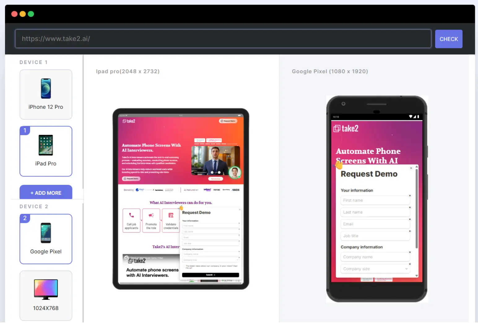
Take2
Take2 is an AI-powered platform that analyzes user profiles (called Pivoters) to assess their skills and match them with tech industry roles that benefit from their experience in other fields.
BluePixel handled the full design and development of their informational website using Figma and Webflow.
What We Did:
- Full responsive UX/UI design
- UX Writing development
- Website development in Webflow
- Interaction design
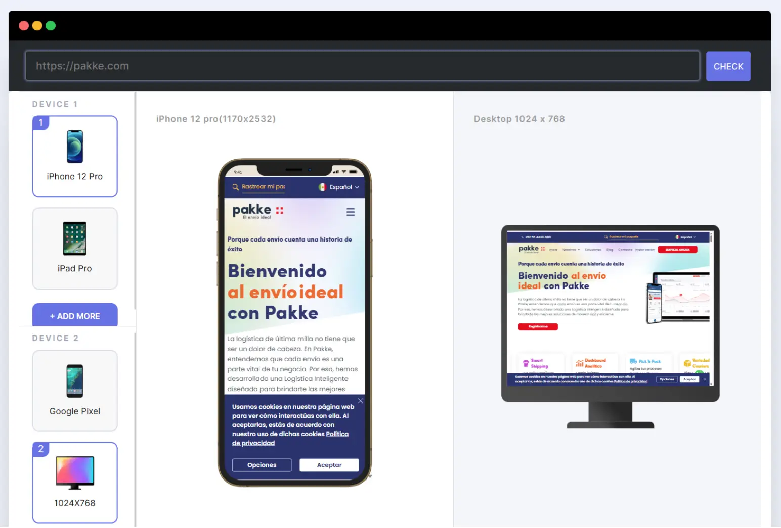
Pakke
BluePixel collaborated with Pakke on the UX/UI design and development of multiple landing pages, graphic assets, and the creation of promotional videos for the brand.
Thanks to the excellent results of this partnership, Pakke referred us to other companies within its group.
What We Did:
- Responsive web design
- UX/UI design and development of 6 landing pages
- Creation of 2 animated promotional videos
- Production of visual assets for their mobile app
Explore more examples of responsive web design, as well as additional UX/UI design projects, in our portfolio.


.png)