

Measuring user experience (UX) with data should be routine for any digital team, because designing based on intuition or personal taste is risky. Research from Stanford showed that 75% of a brand’s credibility depends on the design of its website, and Forrester studies found that an optimised user experience can increase conversions by up to 200%.
According to Google, 53 % of users leave a site that takes more than three seconds to load, demonstrating that UX is a business variable, not just an aesthetic one.
The good news is that today there are many metrics and tools to evaluate the quality of a digital product and improve it with evidence. This guide explores what it means to measure UX with data, why it impacts the business, what the main metrics are and how to turn those data into smart decisions.
Why Does Measuring User Experience (UX) Directly Impact the Business?
Users today demand quick, easy experiences. Data from Google shows that more than 47% of people expect a page to load in under two seconds and 40% leave if it takes longer. A poor UX not only causes abandonment; it harms your reputation and drives up user acquisition costs because you need to invest more in marketing to offset low conversions.
UX as a Competitive Advantage
A fast, intuitive and aesthetically pleasing site is a differentiator. Research from Forrester cited earlier indicates that a well‑designed interface increases the conversion rate and fosters loyal users. Companies like Spotify or Amazon have built advantages based on the user experience and have optimised every step of the purchase flow to eliminate friction and win loyal customers, with mobile usability being a strong point.
What Is Mobile Usability and How Does a Poor Browsing Experience Affect Users?
Mobile usability means the ease of use of a site or app on mobile devices. Google began referencing this metric in 2014, and today ignoring its parameters and the issues highlighted by a UX audit carries a high cost; beyond abandoning slow pages, a poor mobile experience limits your reach.
What Does It Mean to Measure UX with Data?
Measuring UX isn’t just about looking at numbers. Each set of metrics indicates something different.
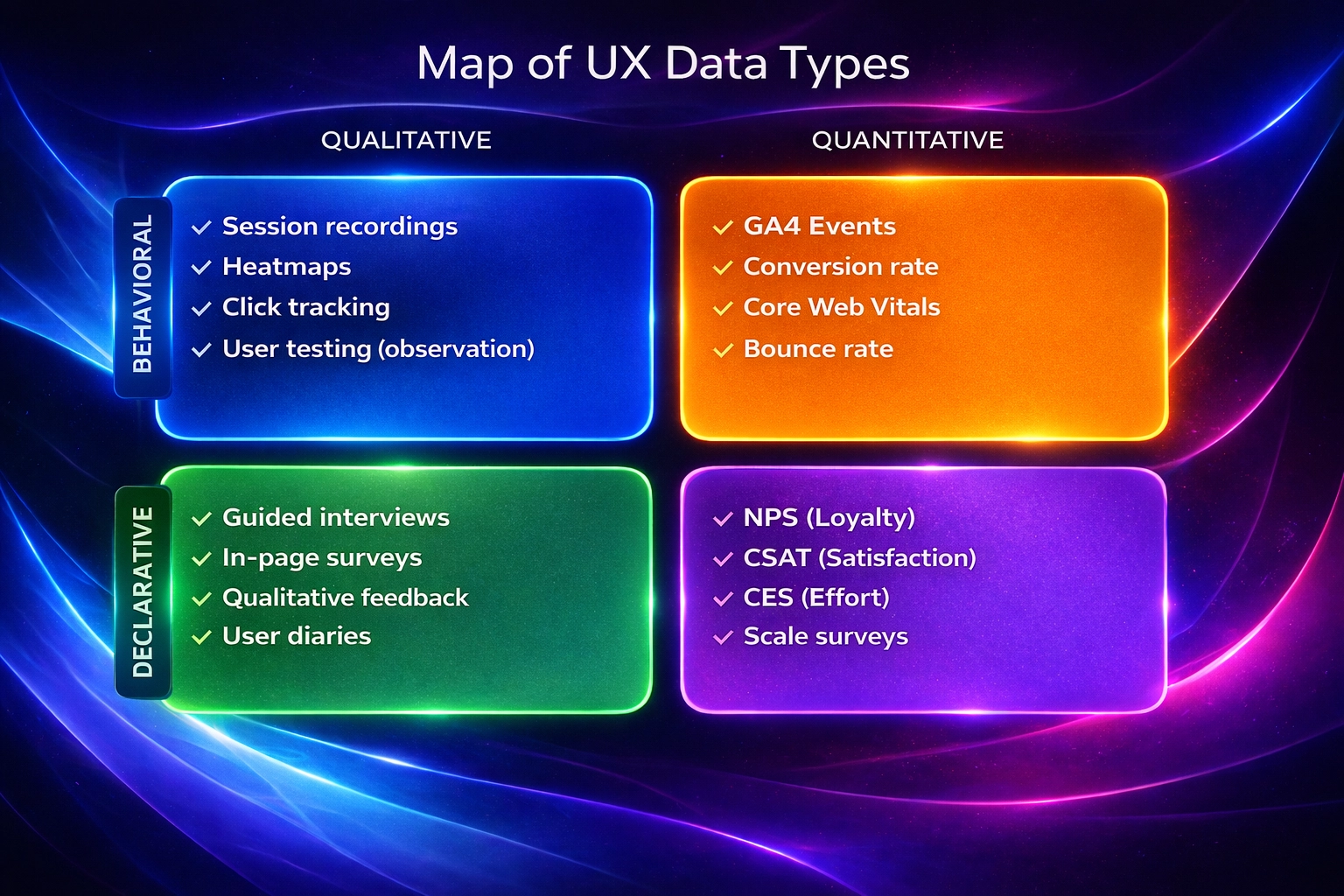
Qualitative vs. Quantitative UX
- Quantitative data answers the what. Its metrics include bounce rate, time on screen or conversion rate; they serve to identify patterns and trends.
- Qualitative data answers the why. It includes interviews, usability tests or session recordings to understand emotions, motivations and expectations. Both types complement each other; a spike in bounce rate can have various causes that you only discover by talking to users.
Behavioural vs. Declarative Data
Behavioural data are captured automatically through pages visited, clicks, scroll depth or form abandonment and show the user’s real intention. Declarative data, on the other hand, are obtained directly from people via surveys or registration fields. They are useful for segmentation but do not reflect how users navigate or where they get frustrated. A good UX analysis combines both types to build hypotheses and prioritise improvements.
Actionable Metrics vs. Vanity Metrics
Not all indicators are useful. Vanity metrics, like counting visitors or followers, can boost your ego but do not help you make decisions or improve the product. Actionable metrics are tied to business objectives and allow you to experiment with concrete changes; for example, measuring conversion rate after modifying a form design. Before monitoring something, ask yourself whether that metric will help you identify problems or validate improvements.
Key Metrics for Measuring UX with Data
The metrics can be grouped into categories to address different aspects of the experience.
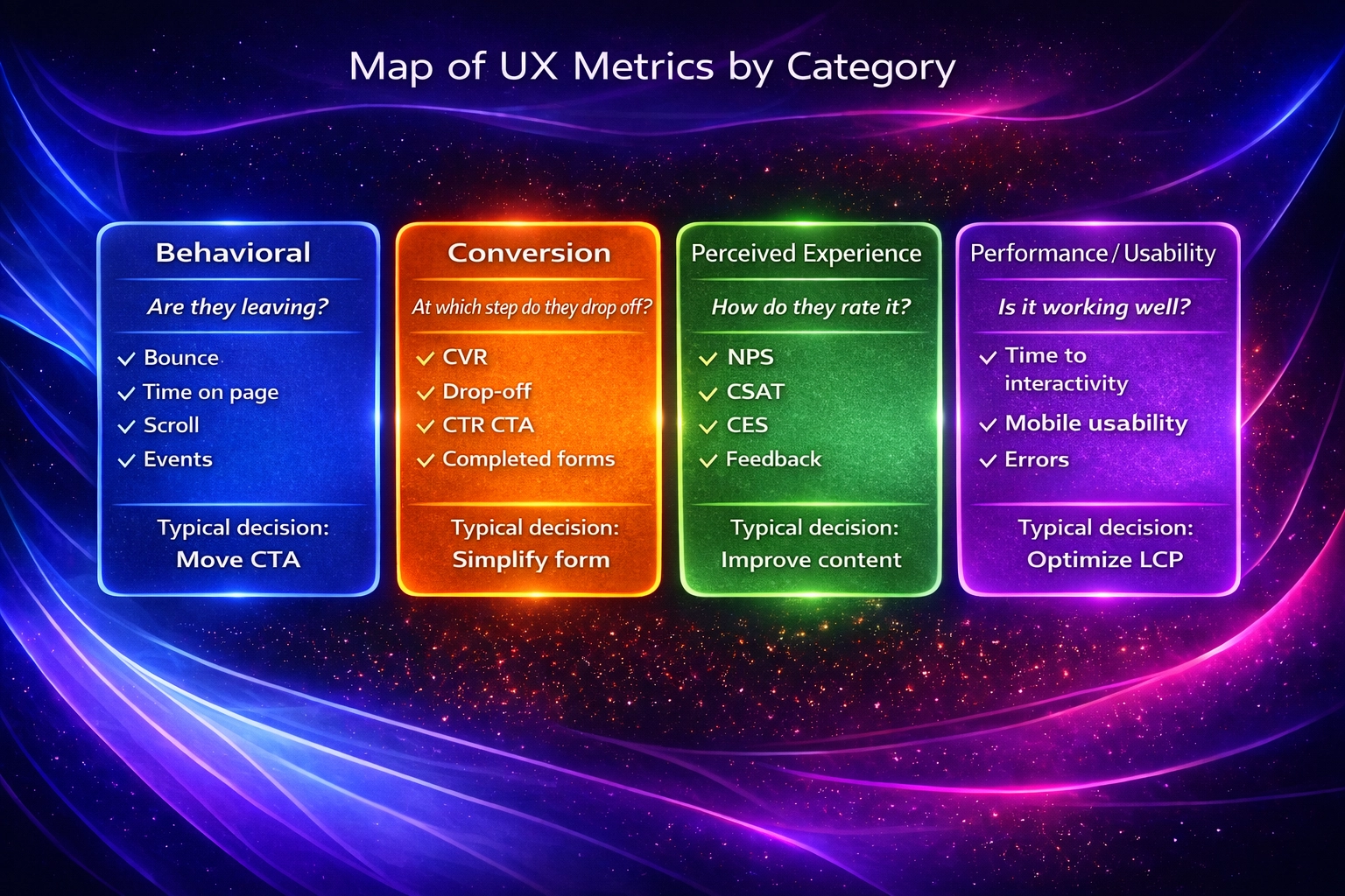
Behavioural Metrics
- Bounce rate – The percentage of sessions that start and end on the same page; calculated by dividing single‑page sessions by total sessions. A high bounce rate may indicate that content is not relevant or that the site takes too long to load.
- Time on page – Measures how long users stay on a page. It helps assess whether content holds their attention or if there are comprehension problems.
- Scroll depth – Indicates how far a visitor scrolls on a page (e.g., 25 %, 50 %, 75 % or 100 % of the content). It helps position key elements like calls‑to‑action in highly visible places.
- Events and micro‑interactions – Capture specific actions such as clicks on buttons, video plays or menu openings. The data allow you to optimise specific interactions and detect friction.
Conversion Metrics
- Conversion rate – The percentage of users who perform a desired action (purchase, subscription, download). It is calculated by dividing the number of conversions by the total number of visitors. It can be broken down into micro and macro conversions to detect incremental improvements.
- Funnel drop‑off – Measures how many people drop off before completing a key action, such as forms, abandoned carts or other funnel steps. Identifying the points where users leave helps optimise the experience and improve conversions.
- CTR on calls‑to‑action (CTAs) – Shows the percentage of users who clicked promotional buttons or links relative to the number of impressions. A low CTR may indicate problems with design, copy or placement.
- Completed forms – Measures the number of subscription, contact or purchase forms successfully completed. This metric detects usability errors or unnecessary fields that cause abandonment.
Perceived‑Experience Metrics
- Net Promoter Score (NPS) – Evaluates loyalty by asking users how likely they are to recommend the company on a scale of 0 to 10. Responses are categorised into promoters (9–10), passives (7–8) and detractors (0–6), generating a score from –100 to +100. A high NPS usually indicates greater retention.
- Customer Satisfaction Score (CSAT) – Measures immediate satisfaction with a service or product. Users are asked how satisfied they are, for example on a scale of 1 to 5, and the percentage of positive responses (score of 4 or 5) is calculated.
- Customer Effort Score (CES) – Evaluates how easy it was for a customer to perform an action. Low CES scores mean users had less difficulty and correlate with greater satisfaction and loyalty.
- In‑page feedback – Quick feedback buttons or contextual surveys on the page that capture spontaneous comments about the experience, especially useful for detecting issues not captured by quantitative metrics.
Performance and Usability Metrics
Core Web Vitals – The set of metrics Google uses to evaluate page performance. It includes Largest Contentful Paint (LCP) to measure the load time of the main content, First Input Delay (FID) to measure initial interactivity and Cumulative Layout Shift (CLS) to assess visual stability. Optimising these values improves search rankings and perceived experience.
- Time to Interactive (TTI) – Indicates when a page becomes fully interactive — that is, when elements respond to user actions. It should be kept as low as possible to avoid frustration.
- Mobile usability – Measures ease of use on mobile devices; Google Search Console reports mobile usability errors to help optimise the experience. It includes aspects such as button size, readability and avoiding horizontal scrolling.
- Errors and technical friction – Monitoring JavaScript errors, error messages and connectivity failures is essential to detect problems that prevent users from completing actions.
Tools for Measuring UX with Data
There are tools with different levels of search intent and specialisation. The most common include:
Digital Analytics
- Google Analytics 4 (GA4) and Google Search Console track metrics like visits, conversions, navigation paths, devices and load times. You can set up custom events to measure specific interactions, such as button clicks.
- Heatmaps and scroll maps visualise behaviour.
- PageSpeed Insights and Lighthouse analyse Core Web Vitals and offer recommendations for optimising site performance.
Behaviour Tools
- Heatmaps – Visualise areas where users interact more or less. They use colours: red indicates high interaction, blue low interaction. They are used to optimise element placement, improve navigation and perform A/B tests.
- Session recordings – Allow you to watch videos of real users using the site or app. They help detect patterns, repeated clicks or confusion.
- Click tracking – Records clicks and taps to identify usability errors or elements that go unnoticed. It complements heatmaps.
User Research Based on Data
- Contextual surveys – Short questions inserted at specific moments, for example after completing a purchase, to gather fresh impressions.
- User testing – Sessions where users are observed performing tasks, yielding qualitative and quantitative data. They can be moderated or remote.
- Interviews guided by metrics – Interviews exploring problems detected by metrics, such as why people abandon the site at a certain step. These allow you to validate or refute hypotheses.
How to Interpret UX Data and Avoid Common Mistakes
Measuring is just the beginning of the process. Correct interpretation prevents wrong decisions.
Check Correlation vs. Causation
It’s easy to confuse correlation with causation. An increase in NPS may coincide with a decrease in bounce rate, but one does not necessarily cause the other. Don’t assume causality without investigating other variables and use behaviour analysis tools to confirm your hypotheses.
Which Metrics Matter Depending on Your Goal
- Improve retention – Focus on NPS, CSAT, CES and abandonment rate.
- Increase conversions – Monitor conversion rate, drop‑off points and the CTR of your calls‑to‑action.
- SEO positioning – Concentrate efforts on improving the Core Web Vitals.
Common Mistakes When Analysing UX
- Sample reliability – Drawing conclusions from too little data leads to wrong decisions. Make sure you have enough volume or supplement with qualitative metrics.
- Forgetting segmentation – Behaviours and needs vary by segment. Analyse by device, region or user type.
- Losing the business perspective – Measuring in isolation can lead to optimisations that do not translate into business results. Each metric should be linked to a goal, whether sales, retention or satisfaction.
How to Turn UX Data into Business Decisions
Prioritise Hypotheses
Create a list of hypotheses based on your metrics. For example: “60 % of users abandon the form at the phone field, so we could simplify that field.” Prioritise according to potential impact and implementation effort.
Design Experiments and A/B Tests
A/B tests consist of creating two versions of a digital asset — landing pages, emails, ads — and showing each version to a group of users to see which yields better results. Half your audience sees version A and the other half version B. The comparison is based on conversion rate. These tests follow the scientific method: change one variable at a time, collect performance data and decide which version to adopt.
Continuous Iteration and Optimisation
Analyse the results of your experiments, implement improvements and measure again. The measure → learn → optimise cycle turns UX into a continuous process, not an isolated project. Combine A/B tests with qualitative analysis to get a complete picture.
Real Examples of Measuring UX with Data
- Conversion case – Google tested up to 41 different shades of blue to determine which colour users liked best. After the tests they found the most suitable shade and its implementation translated into an estimated USD 200 million in annual revenue.
- Abandonment case – In 2016 the Financial Times experimented by intentionally adding extra load times of 1, 2 or 3 seconds for different user segments. They found that the abandonment rate spiked to 7.2 %. With those data they focused on reducing page load times, which attracted 30 % more users.
- Incremental improvement case – Walmart analysed its site data and found that users who converted experienced load times of at most 3.22 seconds. After some experiments, they determined that every second saved in load time translated into a 2 % higher conversion rate, and every 100 milliseconds saved generated 1 % incremental revenue.
When to Measure UX Internally and When to Seek Professional Support
Signs That Your Internal Team Is Not Enough
It is very important to identify when it is viable to conduct an internal analysis and when it is better to look for a specialist. If your company meets any of these conditions, it is better not to risk your operation:
- Lack of time or resources to perform deep research and usability tests.
- Difficulty interpreting complex metrics or identifying the root of problems.
- Need to implement large‑scale changes (redesigns, migrations) that require specialised expertise.
If this is your case, you can contact BluePixel to conduct a comprehensive UX audit of not only your site but also your industry. That way you ensure your website delivers what works, not just what looks good.
Benefits of an Expert Approach
- Improved navigation and accessibility of the product, reducing abandonment rate and increasing conversions.
- Lower abandonment rate – A professional audit detects friction and proposes solutions before they affect revenue.
- Holistic view – An expert evaluates the product from multiple dimensions (business, user and technology), ensuring that improvements translate into tangible results.
Data‑Driven UX as a System, Not a Project
UX measurement should be a continuous system. Every launch or update requires monitoring metrics, learning from real behaviour and optimising. Connecting web optimisation with Conversion Rate Optimization (CRO) turns the experience into a growth engine. To delve deeper into UX and UI concepts, you can read BluePixel’s complete UX/UI design guide or their article on UX Marketing, which explains how design and marketing combine to turn visitors into customers. If you want a thorough review, consult their UX audit guide to identify and fix issues with your digital product.
Frequently Asked Questions About Measuring UX with Data
- Which UX metrics are most important? – It depends on your goals. For conversion, focus on conversion rate, the CTR of your calls‑to‑action and drop‑off points; for retention and loyalty, monitor NPS, CSAT and CES; for SEO and performance, prioritise the Core Web Vitals.
- How often should UX be measured? – Always. Ideally, implement real‑time analytics systems and review metrics weekly to detect quick changes. Conduct deeper audits when you launch new features, change business processes or observe drops in conversion or satisfaction.
- Are UX and CRO the same? – No. Conversion Rate Optimization (CRO) focuses on increasing conversions through experiments; UX covers the entire user experience, including usability, accessibility and satisfaction. They are complementary: CRO relies on UX data, and UX improvements usually increase conversions.
- Can UX be measured without paid tools? – Yes. Google Analytics, Search Console, PageSpeed Insights and basic surveys offer key metrics at no cost. However, heatmaps, session recordings or remote tests provide richer insights and can speed up the improvement process.


.png)